
Dashboards
A tour of the home dashboard. What every card means and how to read it.
The home dashboard is the at-a-glance view of your portfolio. This page walks through each card so you know what you’re looking at, and where to dig in.
1 · The cards
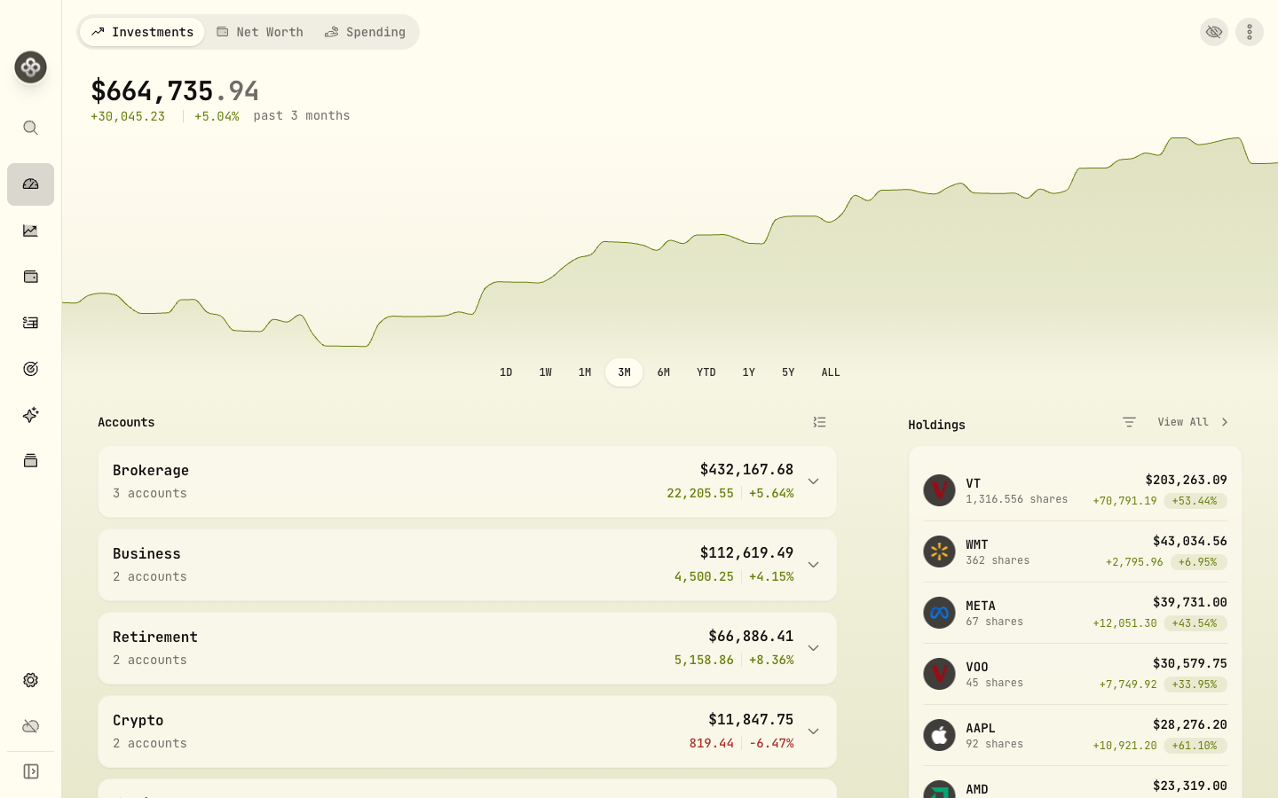
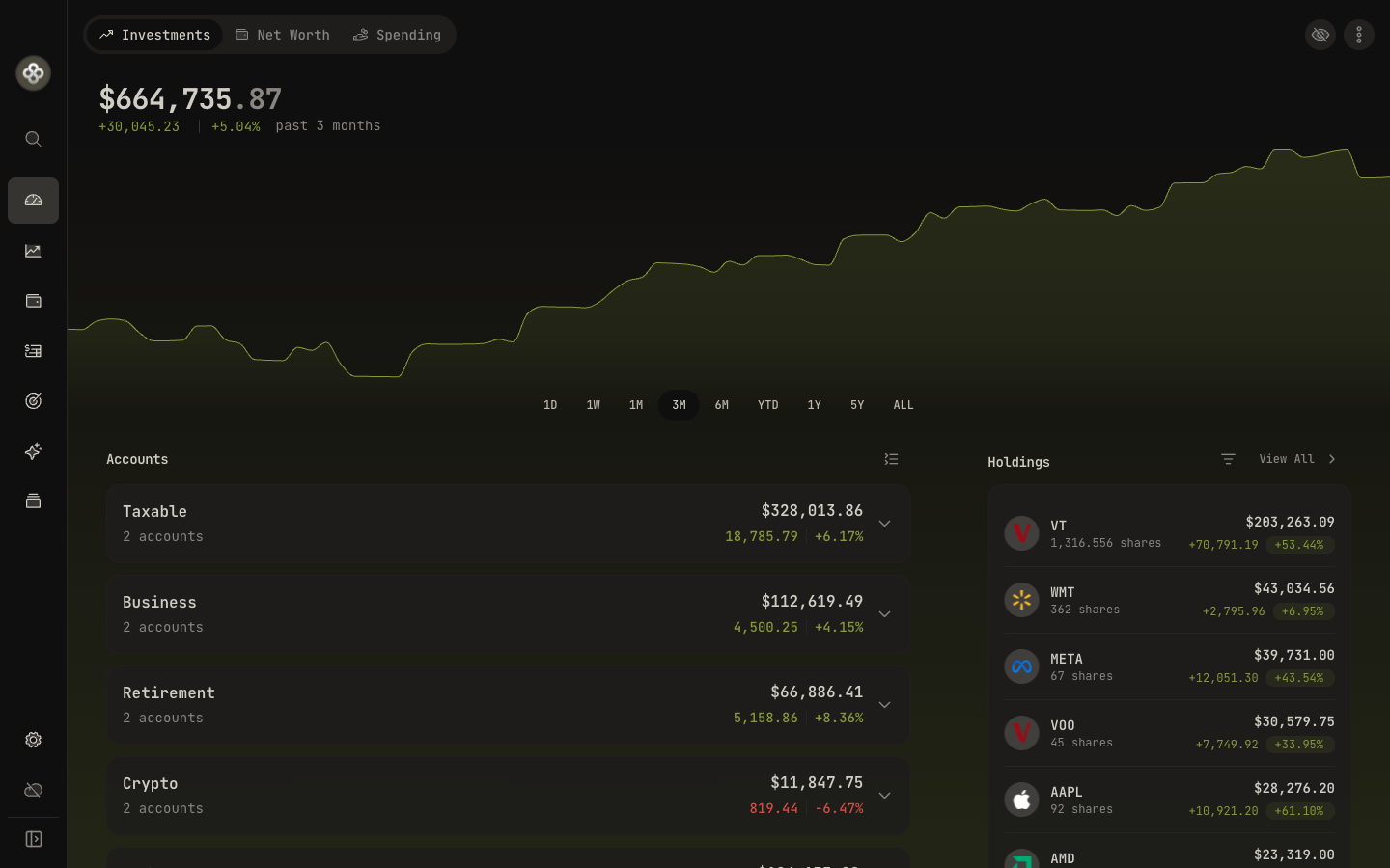
Total Portfolio Value
The headline number. Sums all accounts converted to your base currency at today’s FX rate. Click the eye icon to hide the value (handy for screenshots).
Below the headline:
- Day change: today’s mark-to-market change vs. yesterday’s close.
- All-time change: cumulative change from your earliest activity.
Hover the change percentages for a tooltip explaining the metric (TWR vs. MWR; see Performance Metrics).
Accounts Summary
One row per account, with current value and the day’s change. Click any row to drill into that account’s holdings and activities.
Account groups (if you’ve set any up) roll up underneath their group name. Handy for “Spouse RRSP”, “Joint Taxable”, etc.
Top Holdings
The top 5–10 positions by current market value, with allocation percentage. Click any row to open the asset detail page (lots, price history, dividends).
To see every position, use the Holdings page from the sidebar.
Asset Allocation
A donut chart broken down by asset class (Equity, Fixed Income, Cash, Crypto, Alternative). Hover any slice for the dollar value and percentage.
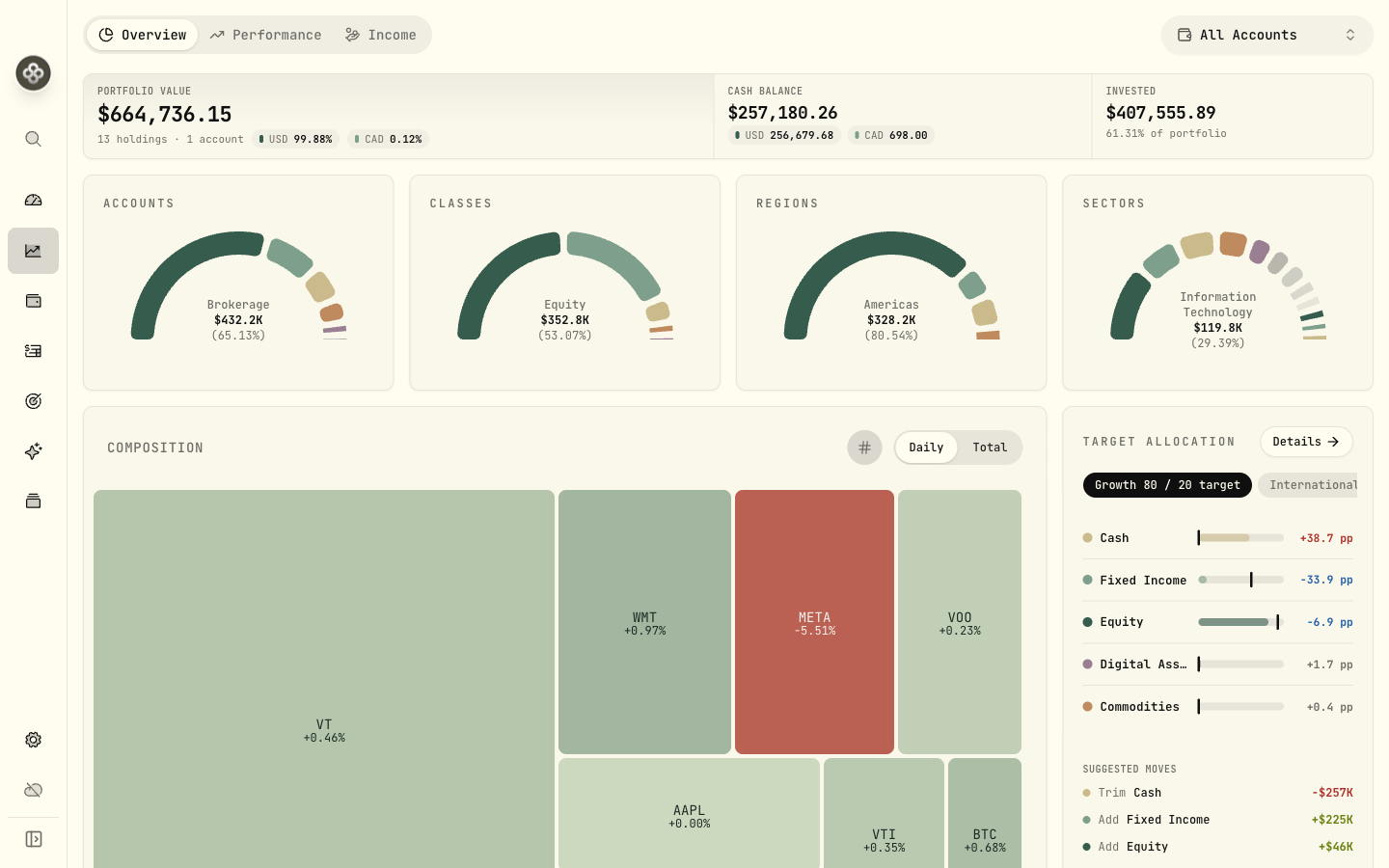
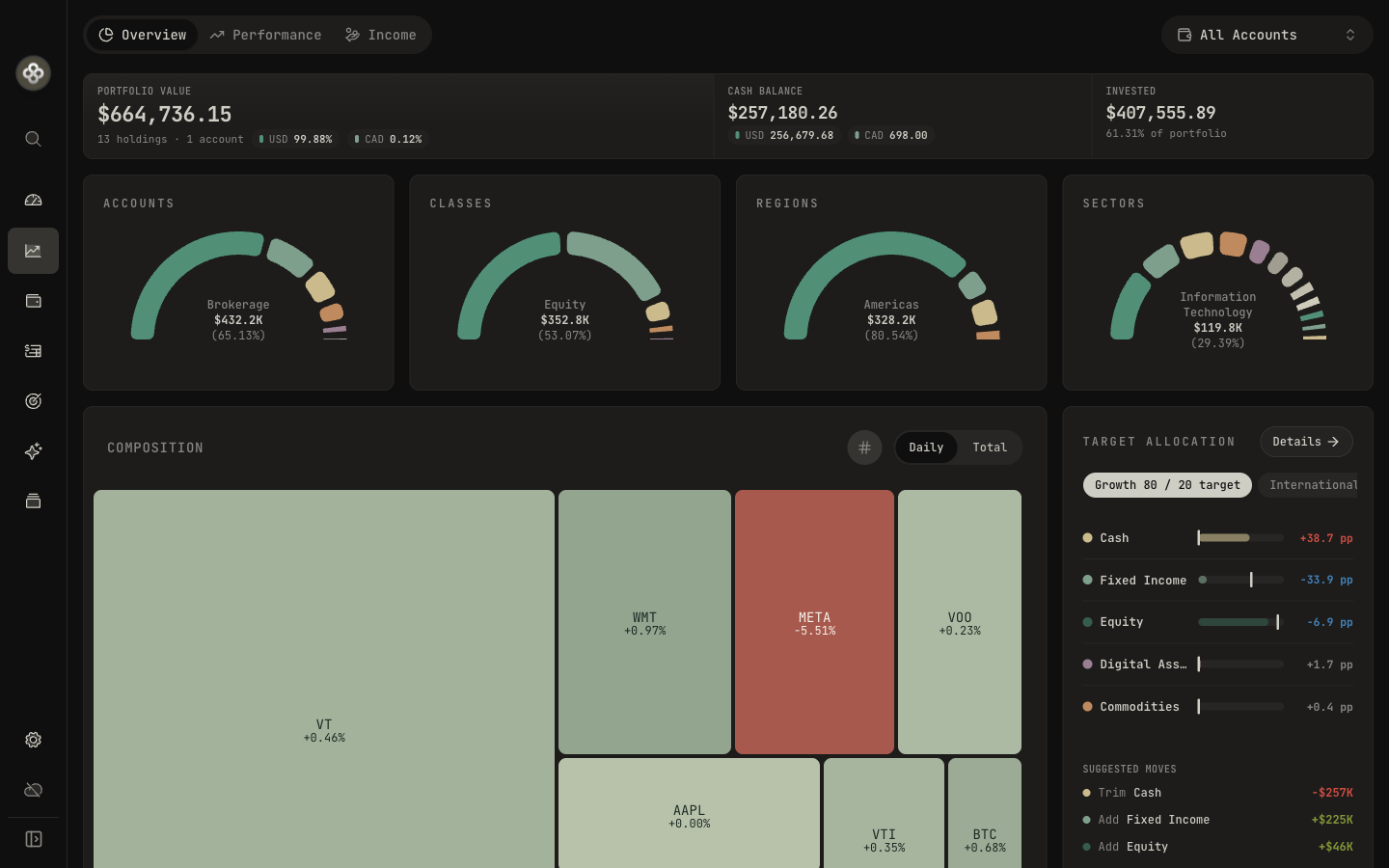
Drill further on the Holdings → Insights tab for sector / region / currency cuts.
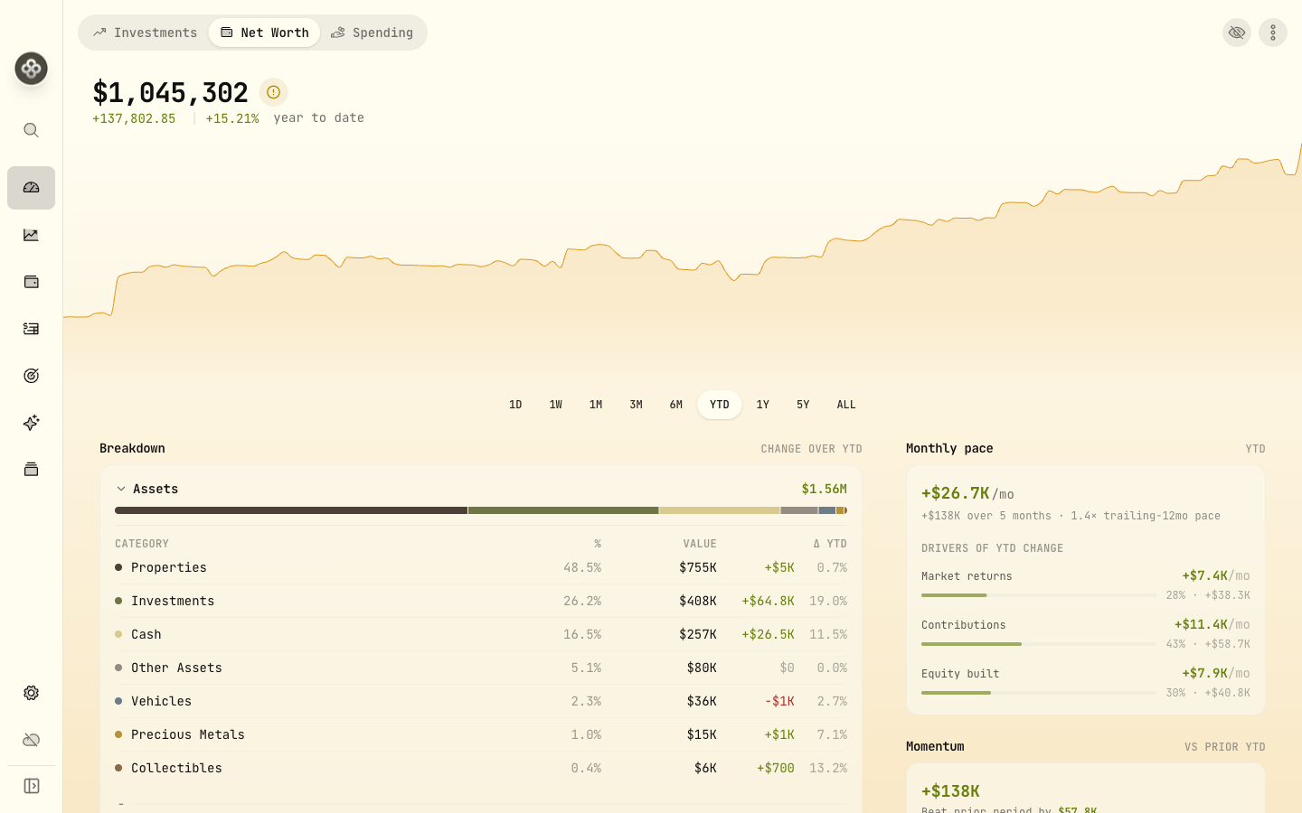
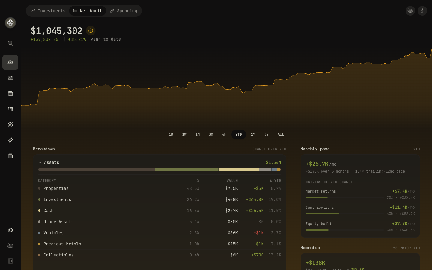
Net Worth Chart
Historical net worth over time, with toggleable account inclusion. Useful for spotting trends and the impact of major contributions.
The chart respects the date range selector in the top right. Switch between 1M, 3M, YTD, 1Y, 5Y, ALL to zoom.
Net Worth dashboard
Switch to the Net Worth tab at the top of the home view for your full financial picture — not just investments, but property, vehicles, collectibles, precious metals, cash, and liabilities. Refreshed in 3.5, it adds:
- A richer breakdown of assets and liabilities, with expandable hierarchical categories and tap-to-expand detail drawers (mortgages net against the property they finance).
- Velocity and Momentum cards — how quickly your net worth is accelerating over the trailing year, and this period versus the equal window just before it.
- A stale-valuation warning for any asset you haven’t updated in 90+ days, with a direct link to fix it.
Spending
New in 3.5: track day-to-day cash flow alongside your investments. Categorize transactions, build budgets, and read narrative spending insights. See the Spending & Budgets guide.
Goal Progress
If you’ve configured savings goals or a retirement target (Goals / Retirement Planning), this card shows progress relative to the deadline:
- 🟢 On track: projected to meet the goal on time.
- 🟡 At risk: projection is tight; small adjustments needed.
- 🔴 Off track: current pace won’t meet the deadline.
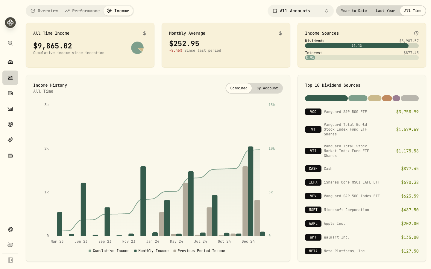
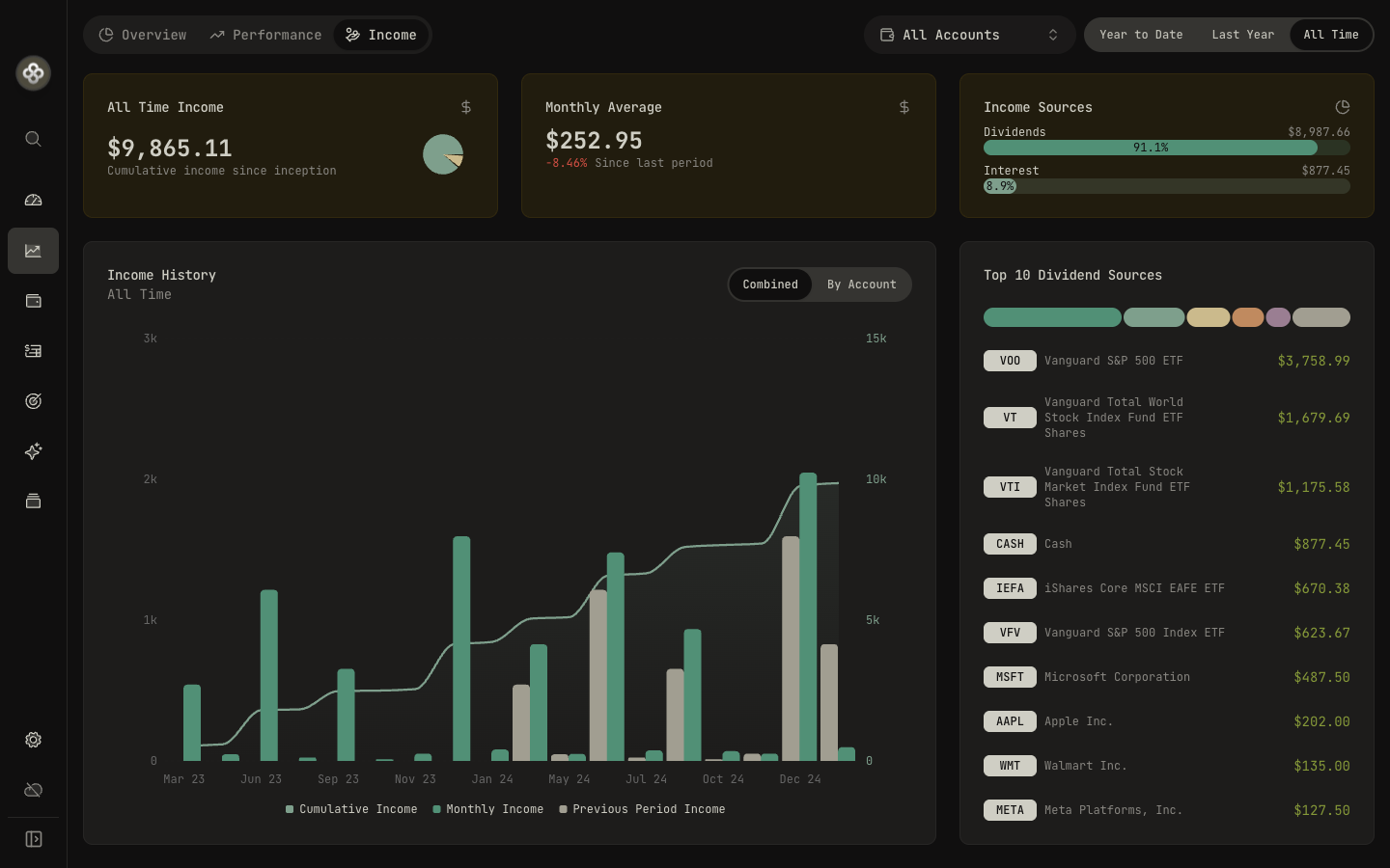
Income Dashboard
Tucked into the Income page from the sidebar: dividend and interest income by period, with breakdowns by account and asset.
2 · Reading the performance numbers
The ”%” on the dashboard and account rows is MWR (money-weighted return) by default. It captures the impact of your timing decisions. The total portfolio also shows TWR when you drill into Performance.
If you’ve never thought about TWR vs. MWR, the Performance Metrics concept doc explains both with worked examples.
3 · Date range and base currency
- Date range (top-right of the dashboard) controls all the charts and change percentages.
- Base currency (Settings → Preferences) controls what currency every total is converted to. Changing it doesn’t move any data; only the display conversion.
4 · When numbers look off
Start with the Health Center. It flags negative cash, stale quotes, and suspect spikes that often explain “why did this jump.” If you can’t find the cause, the FAQ walks through the common “why does my number look wrong” cases.